

In response to the growing demand for remote learning during the pandemic, ViewSonic aimed to develop an innovative online interactive learning software.
At that time, most educational tools on the market were 2D video conferencing software, while the metaverse was primarily focused on personal spaces and social interactions. Therefore, the company sought to combine "education" and the "metaverse" to bring an entire campus into a 3D virtual world, allowing teachers and students to interact and learn through their avatars, creating an immersive educational experience.

During the product development process, we faced different challenges at the early and later stages.
Developed the product from scratch and successfully launched it within a year, working with a newly formed team.
After the product launch, collaborated with an expanded team to scale and enhance the product from 1 to 100.
Jump to see how we scaled from 1 to 100 ->


Developed the product from scratch and successfully launched it within a year, working with a newly formed team.
01
->
Establish core values and development direction
02
->
Define design principles
03
->
Execute UX/UI design
04
Test product usability
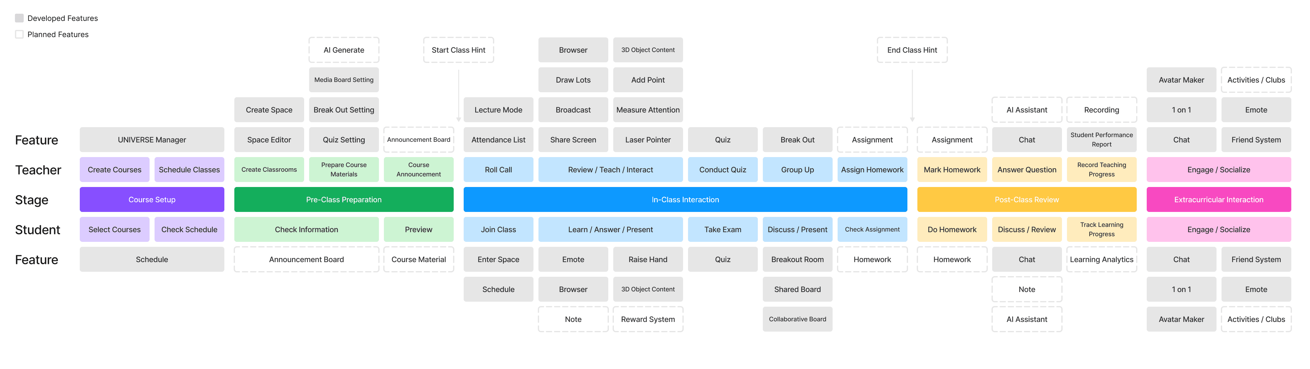
In the early stages of development, I collaborated with PMs and engineers to establish the product's development direction. We identified three key focuses for development: Educational Tool, Immersive 3D Experience, and Social Interaction.

As our product combines both 3D and 2D visual and interactive experiences, we worked closely with 3D designers from the very beginning to establish a cohesive visual direction. Together, we explored how to seamlessly integrate these two elements to create an intuitive and immersive user experience.
Our users fall into two main groups: teachers and students, both from elementary to university levels. Given their distinct needs and usage habits, we designed tailored interaction modes for each:
Through our research on how teachers use other educational software, we found that most teachers still prefer using a mouse-driven 2D interface. To minimize the learning curve and help them get started quickly, we prioritized a 2D interface for teacher-side functions, complemented by optional 3D interactive features. This approach allows teachers to gradually ease into immersive teaching experiences without disrupting their familiar workflows.
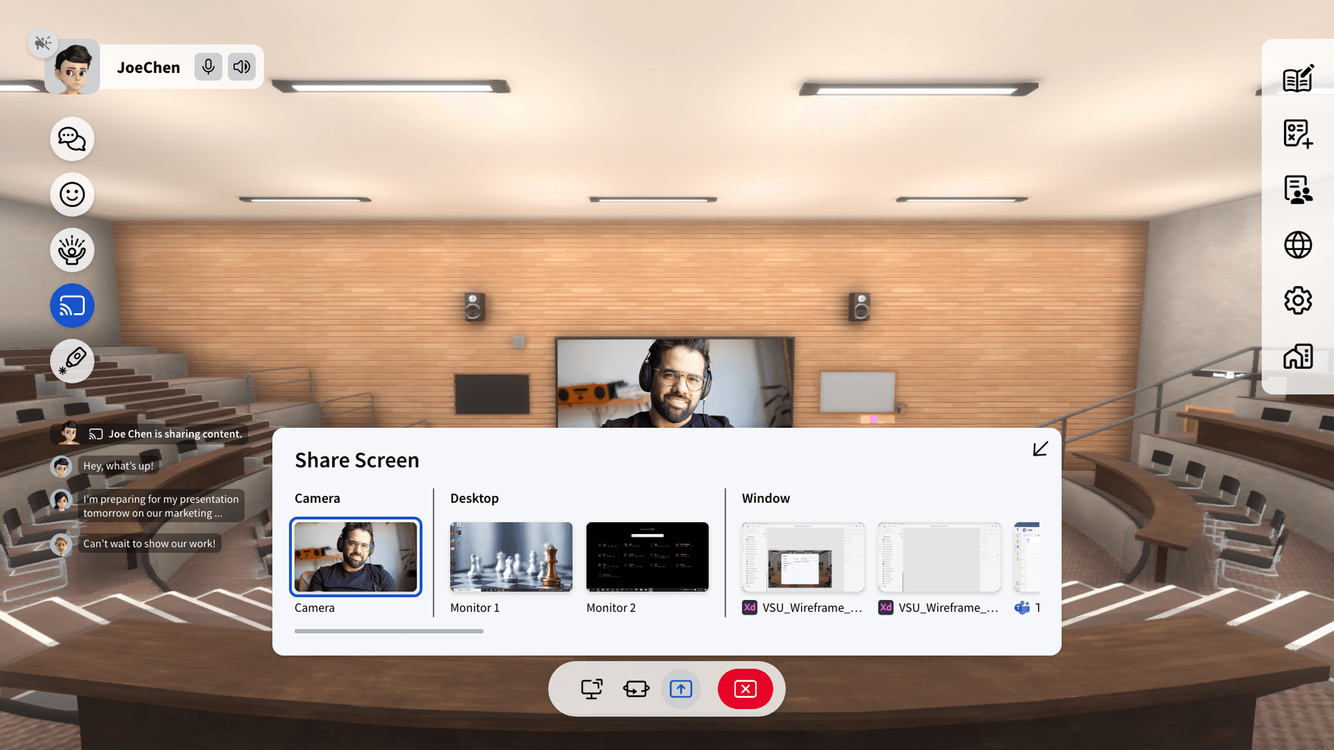
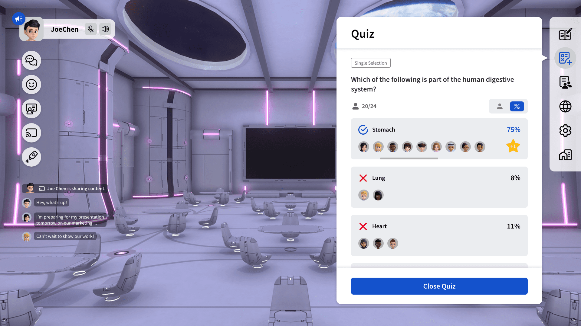
Compared to teachers, students show a higher level of acceptance and demand for exploring 3D environments. Therefore, in the student interface design, we focused on interactivity and gamified learning experiences. Students can freely navigate their avatars using keyboard shortcuts and mouse controls, exploring the 3D campus and interacting with various 3D objects, making the learning process more engaging and dynamic.
We divided the 2D interface into four main sections to maintain consistency across designs and clearly define the layering hierarchy of each area. To minimize interference with the immersive experience, we set the maximum UI size to half of the screen, ensuring the interface remains unobtrusive.
Persistent toolbars are designed with a transparent appearance to reduce their impact on the 3D immersive environment. In contrast, active tool interfaces use solid colors to prioritize clarity and ease of use. For the overall color scheme, we chose blue as the primary color, symbolizing “education” and “technology” and reinforcing the product’s brand identity.

As our product combines both 3D and 2D visual and interactive experiences, we worked closely with 3D designers from the very beginning to establish a cohesive visual direction. Together, we explored how to seamlessly integrate these two elements to create an intuitive and immersive user experience.

Limited Physical Space: In traditional classrooms, group discussions are often constrained by the size of the room and the availability of spaces.
Inefficient Grouping Process: Organizing group discussions takes time, from rearranging seats to confirming group assignments.
Lack of Collaboration Tools: Students in physical classrooms may not always have access to essential collaboration tools like whiteboards, projectors, or shared editing platforms.
With just one click, teachers can quickly bring all students back to their seats and simultaneously manage their microphone and chat permissions. This allows for a seamless transition to lecture mode, enabling the teacher to start the lesson immediately.
Time Management Challenges: When preparing to start a lesson, teachers often spend valuable time waiting for students to return to their seats one by one, which shortens the actual teaching time.
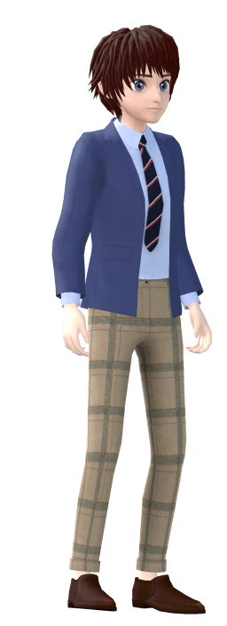
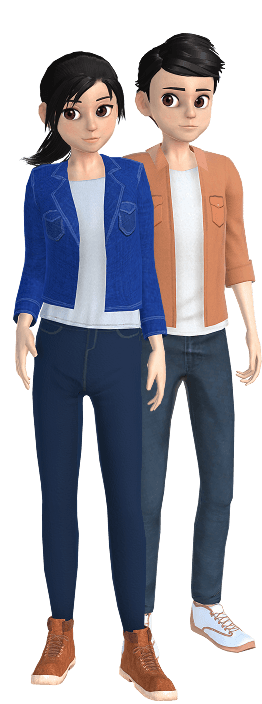
In UNIVERSE, users have the freedom to choose and personalize their avatars, creating a unique digital representation of themselves. With a wide range of customization options, users can easily modify their avatars at any time to reflect their preferences, needs, or mood.

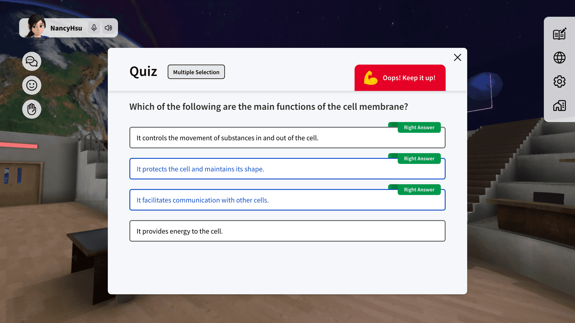
When designing the quiz feature, we initially used "O" and "X" icons to represent true or false answers. However, our U.S.-based product manager pointed out that different countries have varying conventions for indicating true and false. For instance, Western countries typically use "True" and "False." Based on this feedback, we revised the design to ensure consistency and clarity for a global user.

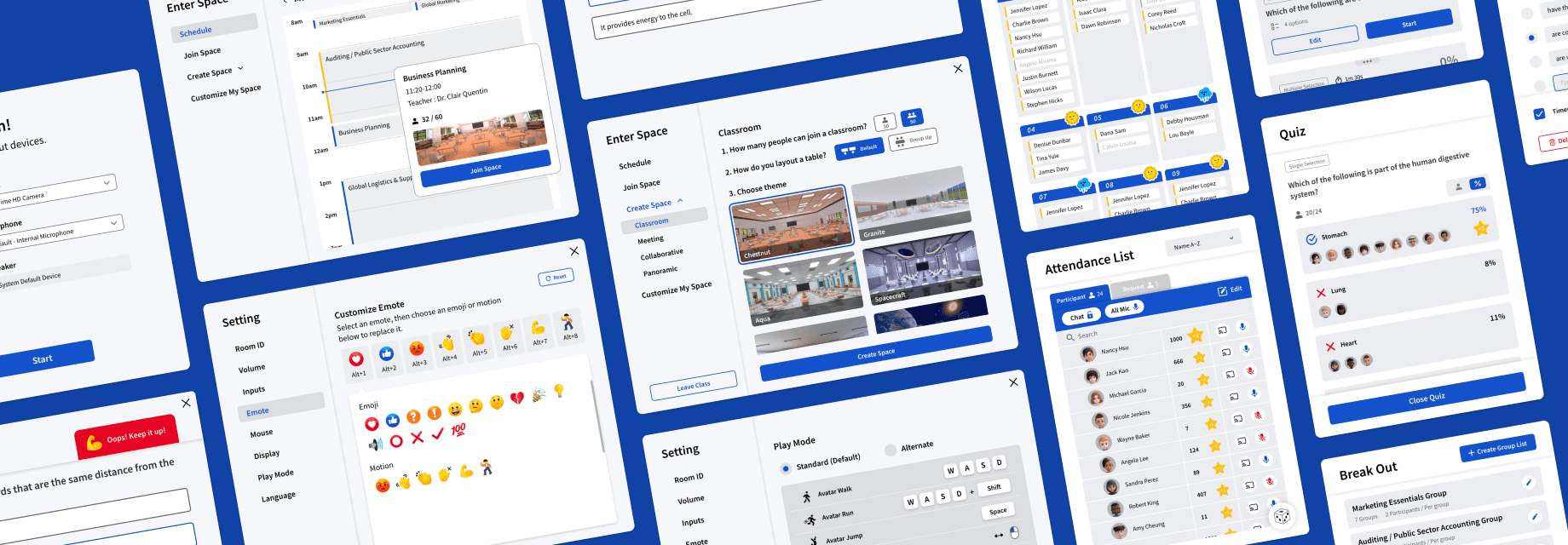
In addition to the features mentioned above, we’ve also developed a wide range of functionalities and designed various types of virtual classrooms ↓


After completing the Beta version, we invited two experienced teachers to conduct a comprehensive usability test for our product.
Participant - 2 Teachers
Over 5 years of teaching experience, currently responsible for training teachers on innovative software tools
Objectives
Identify any issues users encounter when operating key features and optimize based on their feedback.
Gain a deeper understanding of user needs to inform future development and enhancements.
Testing Process
Design a series of specific operational tasks based on different product features.
Observe participants’ actual operations during the test and document any difficulties or feedback they encounter.
Conduct in-depth interviews with participants after the tasks to gather insights on their user experience and suggestions.


Test Feedback
Using the data collected from the tests, we made multiple optimizations to product functionality and operational processes.
The results revealed that, due to our initial focus on feature development, there is still room for improvement in the integration and overall user experience of different features. This test helped us identify cross-feature workflow issues and provided clear direction for future enhancements.

After joining the classroom, teachers often have difficulty finding the Room ID to share with students.
→ Show the Room ID upon joining the classroom, allowing quick copy and sharing.

When the "Start" button is clicked, students are instantly sent to different breakout rooms, which may confuse some teachers who don’t fully understand what’s happening.
→ Added a countdown hint before grouping starts.
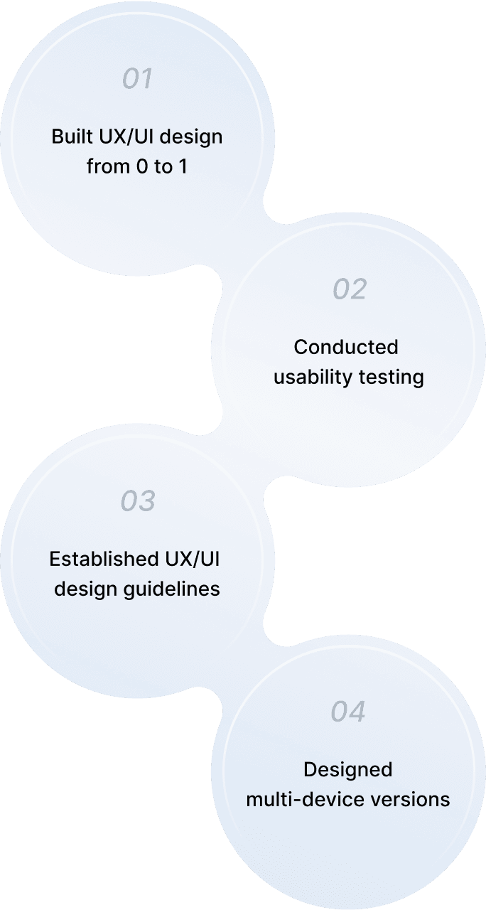
After the product launch, collaborated with an expanded team to scale and enhance the product from 1 to 100.
Multi-Device Development
Windows
iPadOS
Chromebook
VR(Beta)
Web
Data Management
Establishing design system and consolidating components
Centralizing development information on Notion
Product Optimization
Reevaluating user scenarios and identifying feature requirements
Gathering user feedback through workshops and exhibitions
To efficiently deliver multi-platform versions with limited resources, we conducted a comprehensive review of the product’s features and workflows, identifying which parts needed to be redesigned or optimized from the original Windows version. We then prioritized these tasks and addressed them step by step. In later stages, we also incorporated cross-platform adaptability into the design of new features to effectively reduce development costs.
We redesigned the interaction model for iPadOS by adding operation and interaction buttons to replace the keyboard shortcuts used in the Windows version. This ensures a more intuitive and user-friendly experience for touch-based controls.
To enhance the immersive experience in the virtual classroom, we consolidated all functions into a bottom toolbar, minimizing interference from excessive interface elements. Additionally, we focused on developing interactive features between objects and avatars, creating a more engaging and participatory environment.


To ensure consistency across designs, we compiled design considerations and components, gradually developing the design system. This helps maintain a cohesive visual and user experience as the product continues to evolve.


During the fast-paced development process, design assets and information tend to become scattered, making it challenging to maintain efficiency. To address this, we created a comprehensive database in Notion, consolidating all essential design resources. This allows team members to quickly access the information they need, streamlining the development process. Additionally, new team members can use the database to understand past design iterations and decision-making processes, reducing onboarding time.
Notion Spec

You can find the following information in each version record: Implement Time, Designer, Developer, Specifications, and Design Notes.
Definition Table

A reference for product-related terms, providing clear explanations and definitions. This ensures the team uses consistent terminology in discussions and collaboration, improving communication efficiency and alignment.
After completing the first phase of development, we reevaluated user scenarios to uncover opportunities for further product optimization. The analysis revealed significant opportunities for expansion in post-class learning and AI-assisted teaching. As a result, we have established these key areas as the core focus for future development, aiming to enhance the overall learning experience.
We actively collect user feedback through a variety of methods, including hands-on workshops where teachers and students experience UNIVERSE firsthand, as well as participation in major education exhibitions to engage directly with users. These interactions and observations provide valuable insights into real-world needs, allowing us to refine our product and guide future development to ensure it continues to meet the evolving demands of the education sector.

2022 Workshop

2022 EdTech Taiwan

2022 ISTE
Since the launch of UNIVERSE, we have received feedback from teachers and students around the world, proving the value of UNIVERSE in transforming traditional teaching methods. Teachers can create a more immersive learning environment that enhances classroom interaction, while students can learn in a virtual classroom filled with fun and exploration, experiencing a whole new way of learning.
St. Joseph’s R.C. Primary School-Case Study
This was my first time participating in the development of a 3D interactive product, which was a completely different experience from my previous design work. Compared to 2D design, 3D interaction offers more possibilities and expressive ways to engage users. At the same time, it requires a new way of thinking that incorporates spatial depth and the Z-axis into the design process. During brainstorming sessions with my team, I was often amazed by the variety of innovative design solutions and gained valuable insights into new ways of thinking and technical approaches.
Throughout this year-and-a-half-long development journey, I have also come to deeply understand the need to adjust collaboration methods and development processes at different stages of the product lifecycle. In the early phase, we focused on rapid development, leveraging quick iterations to gather immediate feedback and refine our approach accordingly. As the project progressed, our focus shifted towards enhancing the overall user experience, optimizing usability, and resolving conflicts between different features. Additionally, as our team expanded, it became crucial to establish clear design and development guidelines to ensure effective communication within the team while maintaining consistency in future iterations.


